

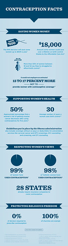
 If you’re going to make an infographic that is 1,800 pixels high, you better have a really good reason. The Obama campaign, well-known for a keen graphic sense unseen in history, put out some facts on the birth control insurance mandate in the form of an infographic that requires five or six scrolls to get to the bottom. Click the reduced version at left to embiggen.
The worst part? There are no maps or charts, even when the infographic tells of 28 states that have already passed contraceptive mandates. It’s an infographic, show it to me!
There are 12 bits of text scattered below 4 headers with a couple nifty design motifs that aren’t actually necessary, bathed in thousands of pixels of blank space, swimming in a depth of an astonishing 1,800 pixels. It would be hard to reduce the density of information conveyed in this “graphic” without giving it sovereign status. I shouldn’t have to work so hard to get facts from someone I believe in.
Not to pick on the Obama campaign (I will still be working fervently for his re-election), but this was just the latest example I saw today. I can’t be the only person who is perturbed by the proliferation of infographics that are 400 pixels wide and 10,000 pixels high. This sort of nonsense would never have survived in the print era because space was limited, so data density was important. Digital has freed us from the limitation of paper, but it hasn’t absolved us of our responsibility to be reasonable.
What they’ve done here is take a perfectly fine list of “12 Reasons for the Obama Contraception Plan” and explode it into something barely usable. I’m not even sure what the point of it is–if it’s to convince you to fill out a sign-up form for email updates, that form is right near the top…get all the way to the bottom, and you have to scroll back up to the top.
I’m not a designer or artist by trade (of course not, I haven’t found the time to do a decent website design), but I do consume information and enjoy trying to translate quantitative data into useful visuals. I’ve prepared a compressed version of the above that requires no scrolling, and recategorizes the factoids into two categories:
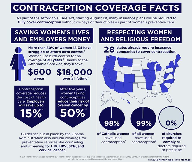
See? Same information, much higher data density.
I hope more talented designers than I will take note: when it comes to visualizing data, form follows function. Please, for the love of God, stop making us scroll more than we have to.