

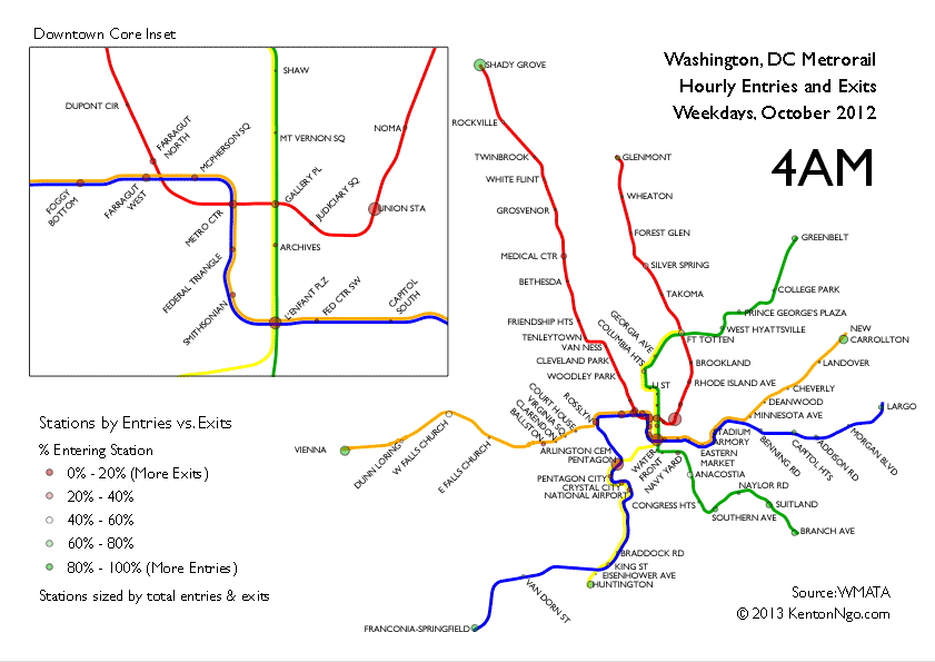
The above graphic maps, per hour, entries and exits per station on a typical weekday on the Washington Metro, similar to this animation of the London Underground. Station data by hour was provided by WMATA for October 2012.
Red stations have more exits than entries in a given hour, while green stations have more entries. Early in the day, commuters flood in from outlying suburban stations and exit in the downtown core. During mid-day, suburban stations are quieter while downtown stations have balanced entries and exits. The commute flow reverses in the evening. We can divide stations into three types as land-use patterns and a station’s purpose can be discerned by their coloring and size behavior.
1) Job centers. The core contains most of the area’s commuter destinations, with Medical Center on the Red Line a notable outlier. During the lunch hour, ridership is higher than in bedroom communities. Riders exit these stations in the morning and enter them in the evening.
2) Bedrooms and park and rides. These stations, mostly outside the core, are nearly empty outside of rush hour. Commuters enter in the morning and exit at night.
3) Transportation hubs. These stations tend to remain white in the map with largely equal exits and entries as long-distance passengers use Union Station and National Airport. Pentagon, despite being home to the world’s largest office building, also sees even entries and exits during most of the rush hour with a large portion of transferring passengers using the Pentagon bus terminal.
4) Mixed-use areas. Arlington County stations between Rosslyn and Ballston are good examples of areas with both jobs and residents, giving them largely even entries and exits during rush hour.
Stations are mapped to their actual geographic location, which looks substantially different than the diagrammatic official map.