Front Page

Schnitzel Shack, Georgia’s finest (and only) German-Thai fusion

When I went to Savannah over Labor Day Weekend (photos), a group of SCAD students I chatted up at the Rail Pub on Congress Street strongly recommended that I eat at a German-Thai fusion place called the Schnitzel Shack.

Wait, what?

According to them, a German immigrant and a Thai immigrant got married, moved to Southeast Georgia, and opened up a restaurant. This was not the first time I had chatted up a random stranger in a city and was given a recommendation to eat a tenderized and fried pork chop, the exact same scenario played out in Krakow, Poland. How does everyone know that pork is my favorite meat? A couple months later, on my drive down from Virginia returning from Thanksgiving, I made a stop in Rincon to see if it was real. A few miles off I-95 in a nondescript strip mall…and yes, it was real, and exactly as awesome as it was made out to be.

I ordered a curry schnitzel, since I was on my own and couldn’t properly split up a German and a Thai dish with a companion. Order it with a beer.

Schnitzel Shack – 6014 Georgia 21, Rincon, GA 31326


Schnitzel Shack

Schnitzel Shack

Schnitzel Shack


Custom Election Maps: The Perfect Holiday Gift

Are you looking for the perfect gift for the political hack that has everything? (Or for yourself.) Why don’t you celebrate their glorious victories by giving them a custom wall map of any state, county, or district in the nation? I’m taking custom commissions, and will print any message you’d like on it. E-mail me at Kenton@KentonNgo.com to get started today! Rates vary by size of map, data layers, and what area of the country I need data from.

They’ll be printed full color on high-quality paper, and it comes with a free tube! Email me your details at Kenton@KentonNgo.com to get started today! Don’t delay if you want your map in time for the holidays!


Infographic: The Electoral College is a Little Bit Racist


♫ Everyone’s a little bit racist sometimes.
Doesn’t mean we go around committing hate crimes.
Look around and you will find
No one’s really color blind. ♫
Avenue Q

It’s well known by now that the Electoral College drastically overweights the voters of small states, to the point where 1 Wyoming resident casts the equivalent of 3.05 votes, and 1 California resident casts only 0.85 votes. Less talked about is how Hispanics and Asians are heavily clustered in large states that are hurt by the Electoral College the most such as California, Texas, and New York. 1 Hispanic voter, therefore, casts the equivalent of 0.94 votes, and 1 Asian voter casts the equivalent of 0.96 votes. This means that the Electoral College is (a little bit) racist.


The Mack-Mack Line: South Florida Father vs. North Florida Son

The Chinese often say that “富不过三代” – wealth is not passed down for more than three generations. My parents had a Chinese proverb for everything, and the fortunes of the fourth generation of the Mack family are no exception.

2012 was not a good year for the descendants of Cornelius McGillicuddy, Senior (1862-1952), better known as Connie Mack. The ghost of the longest-serving manager in Major League Baseball saw his beloved Athletics, in their adopted city of Oakland, lose the ALDS to Detroit in Game 5. What a tragedy!

Of course, that’s not why you’re reading this, there was also an election. Connie Mack’s grandson (the third generation), Republican politician Connie Mack III, was elected Florida’s Class I Senator in 1988 in a 50-50 squeaker, but did not seek a third term in 2000. That year, the seat was taken over by Democratic Senator Bill Nelson, who this year in 2012 gave wayward scion Connie Mack IV a 55%-42% beatdown. Oh, and Connie Mack IV’s wife, Mary Bono Mack, lost her Congressional seat in California.

In the 24 years since Connie Mack III was first elected Senator, and Connie Mack IV lost his bid to win the seat back, the regional party landscape in Florida has changed dramatically. Here, I present to you the Mack-Mack Line that divides North and South Florida. North of the line, Connie Mack IV in 2012 outperformed Connie Mack III in 1988. South of the line, the opposite occurred.


mackmack

Notice how in 1988, both regions performed nearly identically, giving Connie Mack III an small lead. Fast forward to 2012, and the two regions have diverged wildly. Connie Mack IV improved on his father’s standing in North Florida, but got walloped south of the line where 4 out of 5 Floridians live. Even more amusing is that Nelson, a North Florida native, mopped the floor with former Fort Lauderdale Congressman Mack IV in South Florida.


Gwinnett County, Georgia: The Next Stop on the Demographics Express

Newton Leroy Gingrich, former Speaker of the House and failed 2012 presidential candidate, pretended to be “shocked” at the outcome of last week’s presidential election. He shouldn’t be, and he’s certainly smart enough to know that the outcome of this year’s titanic head-on collision on the train tracks of American elections wasn’t exactly hard to forecast. On one side, a lumbering steam locomotive hauling an ever-shrinking proportion of angry whites, and on the other side a bullet train of demographic change.

One of the best examples of this clash is right in Newt’s backyard: Gwinnett County, Georgia, which may in 2016 be the next Republican bastion to fall. Gwinnett, portions of which were in Newt’s Congressional District as he designed the 1994 Republican Revolution, was a viciously conservative white-flight suburb that voted for Ronald Reagan over Georgia’s own Jimmy Carter in 1980 and hasn’t voted for a Democrat since. In 1984, when Reagan was re-elected over Walter Mondale by 18 points nationwide, Gwinnett voted for Reagan by an astonishing 60 points.

But this year? As the vast majority of counties in the United States shifted more Republican compared to 2008, Gwinnett County went the opposite way. McCain carried Gwinnett in 2008 by 10 points, and Mitt Romney? Only 9. When compared to the national average, the slow collapse of the Republican margin in Gwinnett County is stunning:


gwinett1

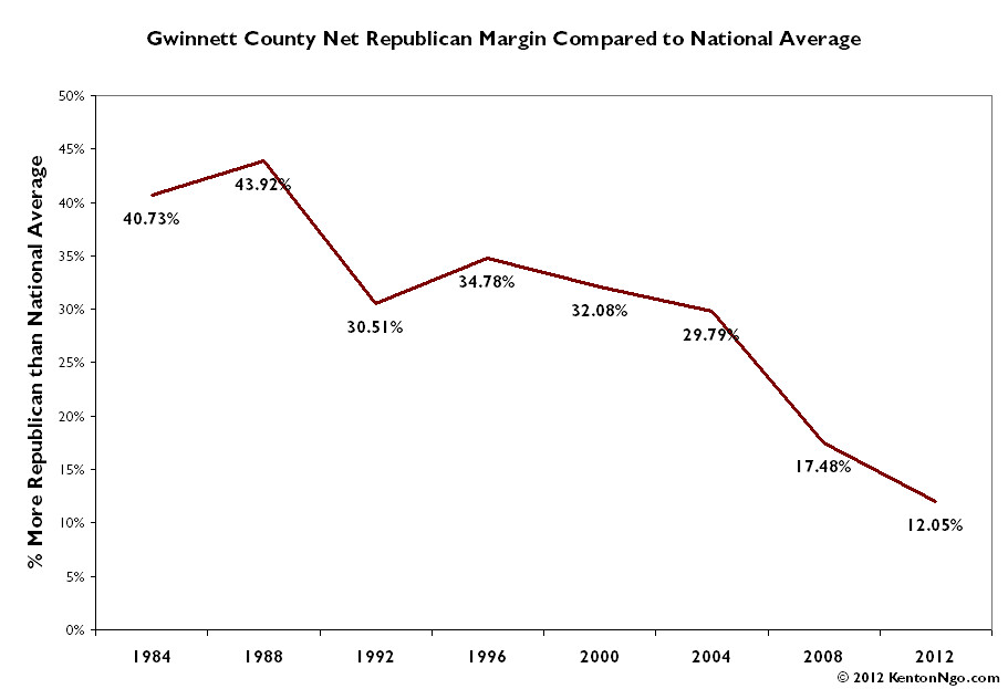
A county that in the 1980s gave Republicans a margin over 40 points more than the national average is now only 12 points more Republican than average. So why the tortured train metaphor at the top of this post? To understand how astonishing this transformation in Gwinnett is, one must first understand MARTA.

MARTA, the Metropolitan Atlanta Rapid Transit Authority, is Atlanta’s subway system: a valuable asset in a city so choked with traffic it is compared to the legendary congestion misery of Los Angeles and Washington, DC. MARTA is not nearly as effective as it could be, though, because it stops right at the Gwinnett County line. Why?


MARTARailMap2010

In 1971, Gwinnett County voters voted in a referendum to reject Gwinnett’s participation in MARTA. Car-owning suburbanites who had just left Atlanta itself feared trainloads of blacks pouring into their neighborhoods. The racially-charged nature of MARTA is still evident today: Urban Dictionary defines MARTA as “Moving Africans Rapidly Through Atlanta.” It has been called the “Mother of All Mistakes” by frustrated Atlanta residents of today stuck in traffic. As this Atlanta Magazine piece explains:

The 1965 and 1971 votes against MARTA by residents of Cobb, Clayton, and Gwinnett weren’t votes about transportation. They were referendums on race. Specifically, they were believed to be about keeping the races apart. Consider the suburbanites voting back then. The formerly rural, outlying counties had exploded with an astonishing exodus of white people fleeing the city as the black population swelled during the civil rights era. This mass migration came at a time when Atlanta was known through its public relations bluster as “The City Too Busy to Hate.”

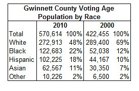
Unfortunately for the angry whites, stopping MARTA didn’t keep the minorities out at all. A county that rejected rapid transit because it would have given blacks easy access to the suburbs is now, after the 2010 Census, majority-minority. In the last 10 years, the white-flight that gave rise to Gwinnett has come to Gwinnett: the white voting-age population actually fell. All of the population growth in Gwinnett County in the last 10 years? People of color.


gwinett2

In this year’s 2012 presidential election, there simply were’t enough angry whites to toss President Barack Obama out of office. The flood of Hispanics and Asians swelling the ranks of suburban counties in Virginia and North Carolina delivered huge margins for President Obama. These votes, joined with an immovable black base, went head-to-head with the white voters of the Old Confederacy. In Virginia, exit polls showed Obama won while carrying only 39% of the white vote. In North Carolina, Obama carried only 31% of the white vote, and came just short of winning: but as the share of minorities increases, underperformance among whites becomes less and less damaging.

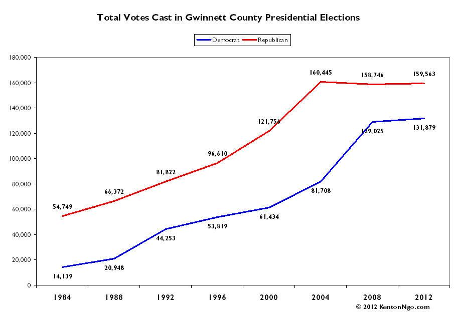
In Gwinnett, the stagnant and shrinking white population is evident in the raw number of votes cast for Republican candidates. After decades of explosive growth, the Republicans have reached a ceiling of 160,000 votes. The explosive growth of the minority population paid big dividends for Democrats in 2008, and held steady in 2012.


gwinett3

What’s even more amazing is that it didn’t have to be this way for the Republicans at all. Even if the black base is impenetrable, the growth in the Asian and Latino populations should not have been so devastating for them. The Asian and Latino populations were enticed by the Republican policies on social issues and taxation, and for some groups Cold War era resentments of being soft on Communism sent them into Republican arms. I would know. As a Chinese-American, I spent a few years of my childhood living in Norcoss in Gwinnett. At the time in the late 90s, the Asian population was starting to explode, and the Chinese filled the pews at the Chinese Bible Church of Greater Atlanta, and filled the farmer’s market every weekend. Nationwide, Asians voted for Bob Dole in 1996. No Republican has carried the Asian vote since, and Barack Obama won Asians with a crushing 73% of the vote.

As the white population of Gwinnett shrinks, and as the Black, Latino, and Asian population grows, the self-inflicted wounds that Republicans gave themselves have turned Democratic-trending minorities into a Democratic base. The simple black and white racial politics that delivered Newt Gingrich-style Southern Whites victories have been scrambled by yellow and brown. It won’t be long now before the county that rejected a train because whites drove cars becomes a diverse, Democratic bastion. The states of the Old South are falling one by one, roughly in order of the growth of their minority populations: first Florida, then Virginia, then North Carolina. It would warm my heart to see Georgia next.

Election data from the indispensable US Elections Atlas.


The Racial Anatomy of a Split Precinct

Gone are the days when redistricting consisted of markers and paper: now we know down to each and every block exactly how many white people over the age of 18 live there. In state like Virginia where white voters and minority voters are in total opposition, this matters.

I do still check on political blogs from the Commonwealth of Virginia, where I grew up. The eagle-eyed Not Larry Sabato blog was watching one particular precinct in Prince William County, Penn, which was split by Republican-controlled House of Delegates and Congressional redistrict, but left intact in the Democratic-controlled State Senate redistricting in 2011. What did this level of attention get them?

The bigger chunk of Penn, about 79% of it, was placed in the 1st Congressional (Rob Wittman) and 51st House of Delegates district (Rich Anderson), while the smaller chunk, about 21% of the precinct went with the 11th Congressional District (Gerry Connolly) 31st Delegate seat (Scott Lingamfelter). In the Congressional map, it was drawn to help all incumbents, so I knew the Connolly chunk was supposed to be more Democratic, while the Wittman area was supposed to be more Republican. In the House of Delegates districts, Republicans were trying to solidify Anderson who narrowly won his seat in 2009, so he got the more Republican area, while the Democratic area went into the much safer GOP seat of Lingamfelter that runs into other strongly GOP areas.

After reading all this, you must be wondering- how effective was this map? Here it is:

Rob Wittman/Rich Anderson portion of Penn precinct
Mitt Romney 1,028 (59.1%)
Barack Obama 710 (40.9%)

Gerry Connolly/Scott Lingamfelter portion of Penn precinct
Mitt Romney 107 (26.4%)
Barack Obama 298 (73.6%)

18.2% Romney margin of victory vs. a 47.2% Obama margin of victory

While political data is available down to the precinct level, the Census Bureau does count every single person by race block by block. In Penn, and other split precincts I saw in the 2011 redistricting cycle, the precincts were mostly split along obvious racial lines. All across Northern Virginia, whiter single-family homes were cleaved from less white townhouses and condos. While it’s certainly possible to link individual modeling scores block by block to attempt to calculate a precinct fragment’s lean, in a state as racially divided as Virginia it almost isn’t useful. Using this map of Penn precinct, I calculated the race population of each precinct fragment. Unsurprisingly, the variance in each fragment’s political performance matched up with race quite closely. This was one of many examples of redistricting deftly taking out minority blocks, not just precincts, and packing them together in super-blue districts.


In the north portion given to the 1st Congressional District that gave Romney 59%, the voting age population is an astonishing 78% white. In the south portion given to the 11th Congressional District that gave Obama 74%, the voting age population is only 38%! You may notice that the block lines don’t match up quite exactly with the precinct lines–precincts are not required to follow Census geography–but the data is close enough to conclude that at least in Penn, Republicans knew block by block what they were doing.


GIF GIS: Animating the Change in Virginia Absentee Ballots

Using data from the Virginia State Board of Elections, I have created this timeseries animation for the county-level change in mail and in-person absentee voting from 2008 and 2012. It is important to note in any analysis of Virginia early vote that it is not a no-excuse state, you must still give a reason even if interpretation of those reasons is fairly lenient: the most common are commuting and working more than 11 hours total on Election Day, travel outside the locality of residence, and going to school away from the locality. Thus, high-commute and high-income communities that have long commutes and many children in college have a higher early vote ceiling than other counties.

Now that animated GIFs are back in vogue, I have pondered uses for them besides amusing cat actions. I can see future uses for them in election GIS. Time-series data especially can be plotted in this relatively lightweight fashion when interactivity isn’t necessary. It also doesn’t require the programming chops a d3.js visualization.