

I’m in my fifth week of political science grad school here at the University of Florida, but I’ve already noticed a few baffling, confusing, and poorly drawn data visualizations in the assigned literature. This isn’t particularly surprising, given the publishing constraints of academic journals and the academic audience, but even in academia good dataviz is important. (Nothing against the authors of the original charts below–it’s fascinating data!)
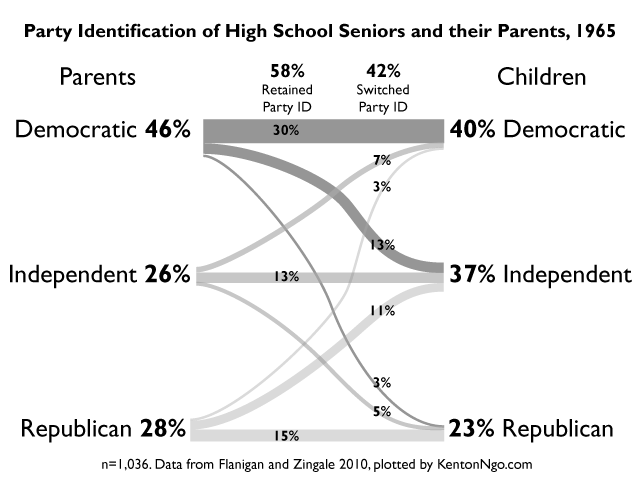
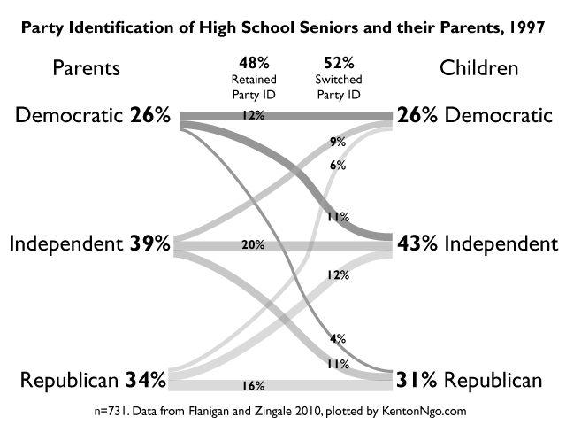
Take this pair of charts from William Flanigan and Nancy Zingale’s “Political Behavior of the American Electorate“, from a panel study that examined how much high school seniors retained the party affiliations of their parents.
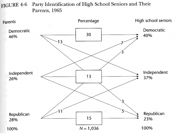
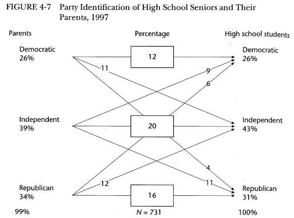
The most important conclusion to be drawn from these charts is that a significant number of children remain in the party, and of those that change, most move into or out of the independent category: there are vanishingly few outright switches. If you stared blankly at them trying to figure out where the numbers came from, you’re in good company. A classroom full of MA and PhD students in the Political Behavior seminar I was in couldn’t grasp it until every label was tallied up. Good data visualization is intuitive, informative, and enhances understanding: if the audience is baffled, that means the chart is bad, not that folks are dumb.
What’s wrong with it?
- All the numbers are percentages: but only half of them are labeled so.
- Three lines cross the middle box, but the label corresponds to only one of the lines underneath.
- Paths crossing the center box can’t be totally followed.
- Every line is the same weight: no intuitive understanding without mentally adding up the labels.
The simple solution to this sort of data (diverging and converging flows) is a Sankey diagram which uses weighted lines to give the viewer an instant understanding of where the major flows of party identifications are. Sankey diagrams are particularly useful in political science, a field where causality is murky and multivariate, because it gives the viewer an intuitive way to weigh the importance of various factors. I have also repositioned the labels so that it is clear which line the labels are referring to. This chart took minutes to design and finish in Illustrator. Compared to a table, which would be more space efficient, this redesign provides all data detail.
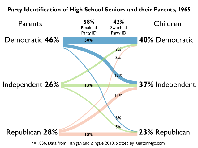
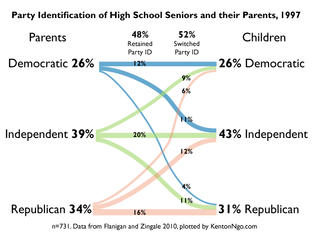
Recognizing that color is not always available in this context, I designed the above to convert well to grayscale and still retain differentiation of the party groups.