Front Page

Interactive Map: Gainesville Mayoral Election

Results by precinct from the March 19, 2013 election for Mayor of Gainesville, Florida are below. The top two candidates in this nonpartisan election will proceed to a runoff.

Mouse over the map to display labels for precincts and roads. You can also use the legend or data table to select precincts by clicking on them.


Legislative Shadow Day at the Florida State Capitol

Once a year, students in my master’s program at the University of Florida follow a member of the Florida Legislature for a day. I was hosted by State Senator Maria Sachs (D), who represents parts of Broward and Palm Beach County.

While Congress is famed and derided for its gridlock, in the 50 state legislatures, especially part-time legislatures like Florida’s, laws move at a dizzying pace. After last week’s shock resignation of Lt. Gov. Jennifer Carroll thanks to an internet gambling scandal, legislators jumped into action.

Legislative Shadow Day
The Florida Senate seal in front of State Sen. Maria Sachs’s (D) office.

Legislative Shadow Day
Sen. Sachs drafting an amendment to last-minute internet gaming legislation.

Legislative Shadow Day
Sen. Sachs and State Sen. Garrett Richter (R) huddle before a contentious meeting of the Senate Committee on Gambling to take up the reform bill.

Legislative Shadow Day
Santa Claus (center) testifies in support of gaming arcades to Sen. Sachs and Sen. Richter.

Legislative Shadow Day
The visitor’s entrance to the Florida State Capitol.

Legislative Shadow Day
Sen. Sachs holds up a binder of constituent emails in support during a meeting of the Senate Agriculture Committee.

Legislative Shadow Day
Florida Senate pages make their rounds.

Legislative Shadow Day
Sen. Sachs briefed before her final meeting of the day.

Legislative Shadow Day
Your author with the Senator.


Happy Birthday T-Mac: Ken Cuccinelli Talking to an Elephant

Former DNC chairman and current candidate for Virginia Governor Terry McAuliffe turns 56 today. My birthday gift to him is reposting this video from 2007 of his Republican opponent, Attorney General Ken Cuccinelli, telling a toy elephant that he needs some help.


Cuccinelli’s team released this video as part of a fundraising pitch while he was a State Senator running for re-election to his Fairfax County seat, but quickly took this video down. (Earlier in his political career, his newsletter, the “Cuccinelli Compass”, did a very accurate job of reflecting the man’s slight quirkiness. This personality trait served him well as it helped to balance out his strident conservatism.) Unfortunately for him, I was able to rip it off YouTube after it had been deleted: back in the day, YouTube didn’t clear deleted videos off their server as quickly as they do now.

Happy Birthday to the Macker! Right, Ron?


Terrible Charts in Political Science Literature

I’m in my fifth week of political science grad school here at the University of Florida, but I’ve already noticed a few baffling, confusing, and poorly drawn data visualizations in the assigned literature. This isn’t particularly surprising, given the publishing constraints of academic journals and the academic audience, but even in academia good dataviz is important. (Nothing against the authors of the original charts below–it’s fascinating data!)

Take this pair of charts from William Flanigan and Nancy Zingale’s “Political Behavior of the American Electorate“, from a panel study that examined how much high school seniors retained the party affiliations of their parents.

origptyid1

origptyid2

The most important conclusion to be drawn from these charts is that a significant number of children remain in the party, and of those that change, most move into or out of the independent category: there are vanishingly few outright switches. If you stared blankly at them trying to figure out where the numbers came from, you’re in good company. A classroom full of MA and PhD students in the Political Behavior seminar I was in couldn’t grasp it until every label was tallied up. Good data visualization is intuitive, informative, and enhances understanding: if the audience is baffled, that means the chart is bad, not that folks are dumb.

What’s wrong with it?

  • All the numbers are percentages: but only half of them are labeled so.
  • Three lines cross the middle box, but the label corresponds to only one of the lines underneath.
  • Paths crossing the center box can’t be totally followed.
  • Every line is the same weight: no intuitive understanding without mentally adding up the labels.

The simple solution to this sort of data (diverging and converging flows) is a Sankey diagram which uses weighted lines to give the viewer an instant understanding of where the major flows of party identifications are. Sankey diagrams are particularly useful in political science, a field where causality is murky and multivariate, because it gives the viewer an intuitive way to weigh the importance of various factors. I have also repositioned the labels so that it is clear which line the labels are referring to. This chart took minutes to design and finish in Illustrator. Compared to a table, which would be more space efficient, this redesign provides all data detail.

PartyID1-opa

PartyID2-opa

Recognizing that color is not always available in this context, I designed the above to convert well to grayscale and still retain differentiation of the party groups.

PartyID1-opabw

PartyID2-opabw


GIF: Deeds’ and Hanger’s 24 Year Redistricting Dance

DeedsHanger
State Senators Creigh Deeds (D-Bath) and Emmett Hanger (R-Mount Solon) were the only two Senators in last week’s Republican-proposed mid-decade redistricting to be thrown into the same district.

Should both seek re-election without moving, they would battle each other for the new 24th District in 2015, 24 years after Deeds defeated then-Delegate Emmett Hanger for House District 18 in 1991.

In the decades since, elections and redistricting have radically shifted the territory they have represented, overlapping and adjacent, to the point where they are barely connected at all to their original bases, shown in the animation at right.

1983 Election (not shown) – Emmett Hanger elected to the House District 26.

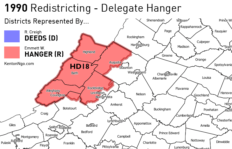
1990 Census – Democratic-controlled redistricting pushes Hanger into House District 18.

1991 Election – Deeds defeats Hanger in House District 18.

1995 Election – Hanger is elected to the Senate District 24, they share the area in purple.

2000 Census – Republican-controlled redistricting pushes Deeds into House District 12. Deeds territory heads south, Hanger territory heads east and they no longer share territory.

2001 Special – State Sen. Emily Couric dies and Deeds, after winning re-election to his House seat, wins a special election to Senate District 25.

2011 Census – Democratic-controlled redistricting stretches Hanger’s district even further east.

2013 Mid-Decade – Proposed redistricting places both Deeds and Hanger into Senate District 24.

(I’ll be happy to add a frame for 1983 if a Virginian can dig and scan in a map of the 1980 districts, presumably in a nearby library: Kenton@KentonNgo.com.)


MAP: New Proposed Senate Districts with 2012 Election & 2010 VAP Race

SD_VAPrecinctSmall
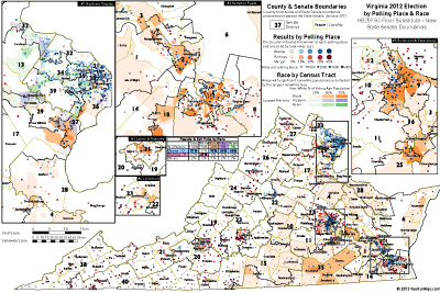
I have updated my previous visualization of 2012 polling-place returns in Virginia that showed a serious racial divide between diverse precincts and white precincts to include the mid-decade district lines rammed through the State Senate on Monday. See previous for comparison maps and old to new district redistribution figures.

Areas are shaded by their total non-white percentage and also whether those areas were more ▰ Black (orange), ▰ Hispanic (purple), or ▰ Asian (green). ● Blue dots showing Democratic precincts cluster in diverse areas, growing more intense as nonwhite population increases, while ● red dots showing Republican precincts correlate tightly to white areas.

Note the new Senate District 25 in Southside Virginia, which is a new majority-black (orange) district, and in Northern Virginia Senate District 37, which is a minority coalition district. These were deliberately drawn to pass Voting Rights Act muster.

Full-size graphic after the jump.

Read More »


INTERACTIVE: Virginia Mid-Decade Redistricting Senate Map

UPDATE 7:35PM: Using official shapefile released by Virginia Division of Legislative Services, see this Google map of new districts. See this post for comparison maps and continuing coverage.